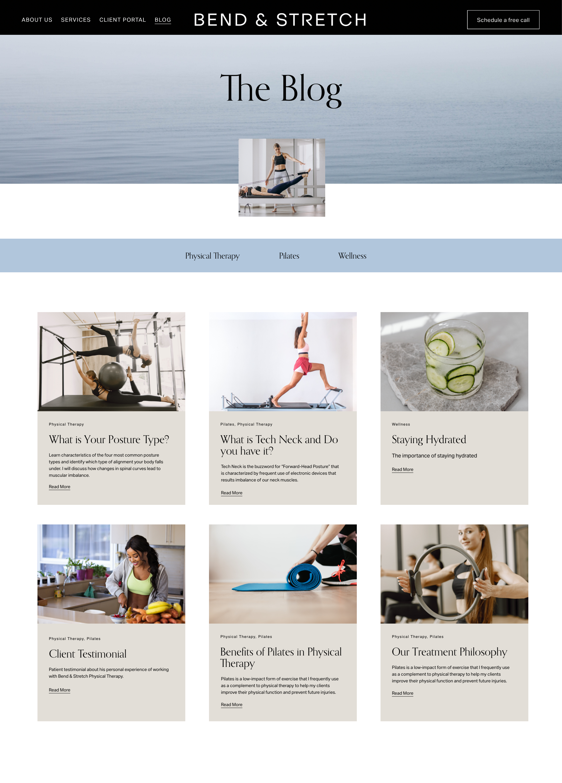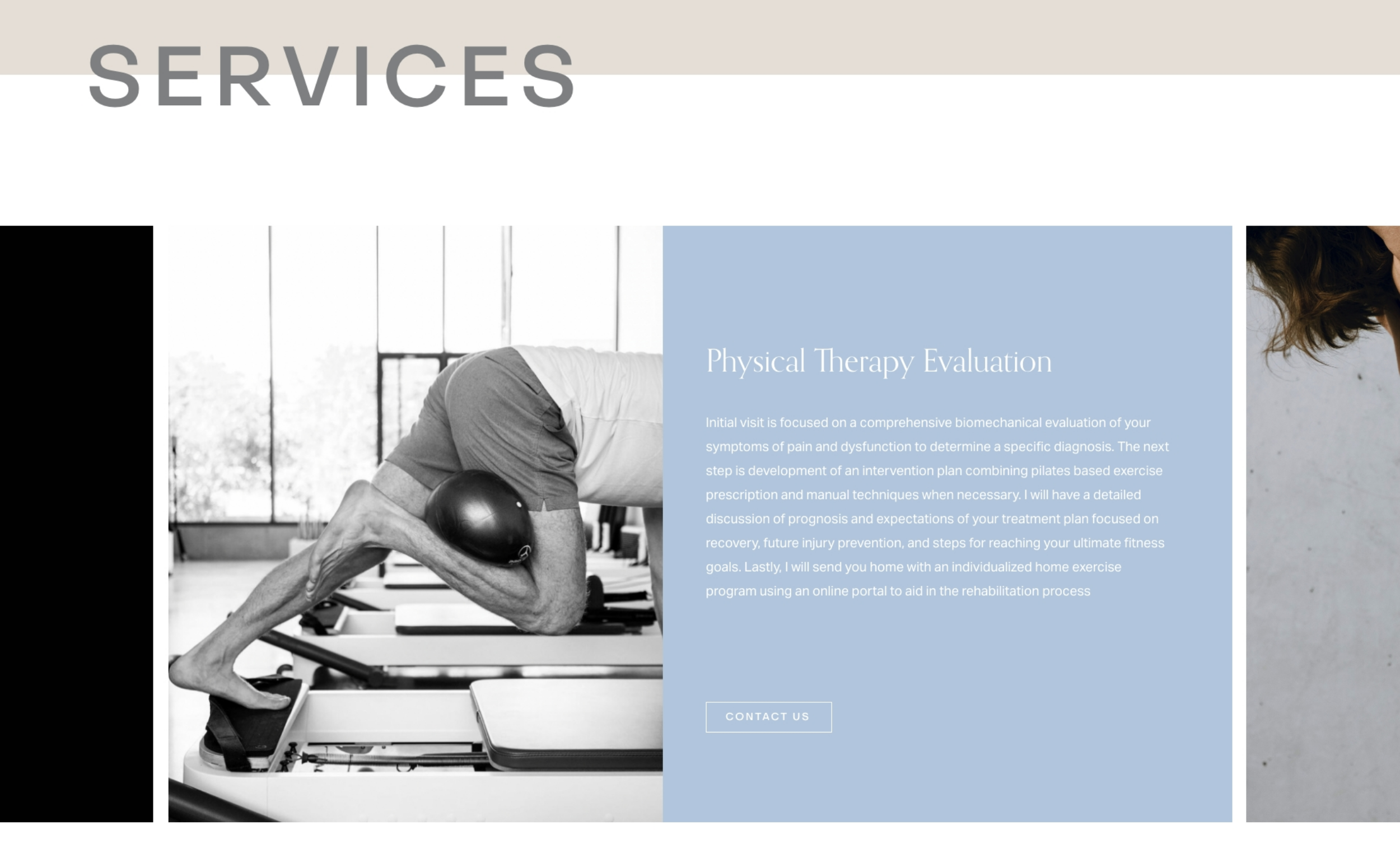
Bend & Stretch
BRAND IDENTITY, SQUARESPACE DESIGN & DEV
Bend & Stretch is a pilates and physical therapy studio in Seattle, WA. Bend & Stretch provides provides one-one pilates classes and physical therapy sessions. Kateryna came to me looking for a modern brand identity and website.
-
When Kateryna came to me, she had outgrown her branding and needed a refresh. She felt that her branding was no longer attracting the clients she wanted to serve. I wanted to create an identity that would appeal to a demographic made up of higher educated males and females between the ages of 25-75.
-
Before I begin the design process. I needed to understand Bend and Stretch’s mission, values and target market. With Kateryna’s broad target audience; I set out to design an identity and website which would highlight her unique services and attract the right clientele.
-
From the start, I knew I wanted to keep the design clean, modern and calm. I picked a modern san serif font called Object Sans. I customized the B and the R to create a distinct logo. The colors are natural with a modern and professional feel. The colors within the palette compliment each other perfectly and have a contemporary and balanced touch.


Modern
Minimal
Authentic


